Understanding the Importance of Aesthetics and Functionality in Brand Design
Why Aesthetics and Functionality Go Hand-in-Hand
Picture this: You walk into a beautifully designed café, with sleek furniture, warm lighting, and eye-catching art on the walls. But then, the menu is confusing, the chairs are uncomfortable, and the service is chaotic. Would you stay? Probably not. The same principle applies to
brand design. A brand can look stunning, but if it doesn’t work seamlessly for its audience, it’s like that café—forgettable.
Balancing aesthetics and functionality isn’t just a nice-to-have; it’s a must. It’s about creating an experience where beauty meets practicality. Think of brands like
Apple. Their products are visually iconic, but they’re also intuitive to use. That’s the sweet spot every brand should aim for.
- Aesthetics: This is your first impression. Colors, typography, and imagery create emotional connections.
- Functionality: This is what keeps people coming back. Navigation, clarity, and ease of use build trust.
Finding the harmony between these two isn’t a science—it’s an art form. But when done right, it’s the difference between a brand that’s admired and one that’s adored.
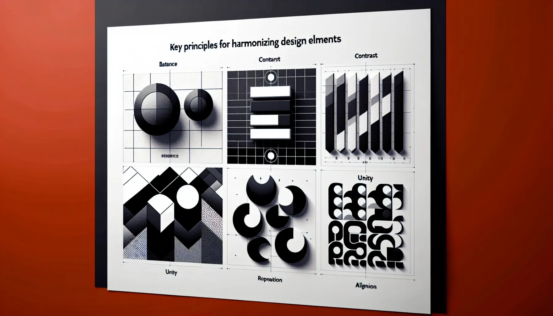
Key Principles for Harmonizing Design Elements
Designing with Heart and Strategy
When it comes to modern brand design, it’s not just about making something look “pretty” — it’s about crafting a story, a feeling, and a purpose all at once. Think of it like cooking your favorite dish: the aesthetics are the plate presentation, but the functionality is the flavor that keeps people coming back for more.
Picture this: You’re scrolling through social media, and suddenly a brand’s logo or packaging stops you in your tracks. Why? Because it connects with you on a deeper level. That’s the magic of blending
visual allure with practical brilliance.
So how do you find that sweet spot? Start by asking yourself:
- Does this design solve a problem or make life easier for my audience?
- Will it still resonate with them a year from now?
- Am I choosing colors, fonts, and shapes that align with my brand’s soul?
Remember, successful design isn’t about choosing one over the other. It’s about creating harmony — a symphony where both beauty and brains take center stage.
Strategies to Blend Visual Appeal with Practical Usability
Why Emotion Drives Design Decisions
Imagine walking into a room that’s not just well-decorated but feels like it was made for you. That’s the magic of balancing
aesthetics and
functionality. It’s not just about looking good; it’s about making people feel something. A brand is no different. When your design speaks to both the heart and the mind, you’re no longer just a company—you’re an experience.
Think about Apple. Their products don’t just function flawlessly; they *whisper elegance*. The sleek curves of an iPhone aren’t accidental—they’re intentional, designed to spark desire while ensuring usability. Your brand can do this too, but only if you get personal with your audience.
- What do they crave emotionally? Comfort? Confidence? A sense of belonging?
- How do they navigate their world? Fast-paced or detail-oriented?
When you marry these insights with thoughtful design, you create something irresistible. The secret sauce lies in the details: a button that feels intuitive to click, a color palette that soothes the eyes, or typography that whispers sophistication. It's never just "design"—it's storytelling.
Case Studies of Successful Modern Brand Designs
Lessons from Real-World Branding Triumphs
When it comes to modern brand design, nothing speaks louder than real-world examples. Let’s dive into some jaw-dropping case studies that balance aesthetics and functionality with the finesse of a tightrope walker.
Take
Airbnb, for instance. Their rebranding wasn’t just a visual facelift; it was a complete transformation of how people perceive home-sharing. The logo? It’s not just a symbol—it’s a feeling. Dubbed the "Bélo," it represents belonging, a concept woven into every corner of their user experience. Even the soft, rounded typography whispers, "Come as you are."
Or consider
Spotify. Their minimalist green and black interface is no accident. It screams clarity, allowing the music to take center stage while making navigation effortless. And don’t get me started on their personalized playlists like "Discover Weekly." That’s functionality meeting emotional resonance, wrapped up in a digital bow.
- Consistency: Both brands nail it across every touchpoint—from apps to ads.
- Emotion: They speak to the heart, not just the eyes.
- Utility: Sleek designs that solve real problems.
These brands don’t just sell services; they create worlds. What world will your brand build?
Tips for Designers to Achieve Balance in Their Work
Weaving Functionality into the Fabric of Design
Balancing beauty and purpose in brand design is like walking a tightrope—thrilling, challenging, and oh-so-rewarding when you get it right. Imagine this: your design looks stunning, but the user struggles to navigate it. Frustrating, right? That’s why we don’t just create art; we solve problems.
Here’s a little secret: functionality doesn’t have to feel cold or utilitarian. It can shine just as brightly as aesthetics when treated with care. Think about a sleek, modern website where every button feels intuitive, every scroll seamless. That’s not just design—that’s magic.
To make functionality your best friend:
- Prioritize clarity: Start by asking, “What’s the one thing users absolutely need here?” Cut the fluff, keep the focus.
- Test relentlessly: What works in theory might fail in practice. Put your designs in front of real eyes and tweak based on feedback.
Remember, every time you simplify a complex process or make navigation second nature, you’re weaving functionality into your creative masterpiece. The result? A brand that doesn’t just look good but feels right.